Today’s designers are taking cues from psychology and exploring an emerging sensibility: transparency. Whether it be clear, translucent or the combination, the potential of glass for voyeuristic play is very intriguing. I have always been drawn to objects, interior spaces or architecture that exposes something, draws your eye thru space or defines our relations to others. Transparency can shape the experience: to observe or be observed is a provacative notion and design like this provokes emotion. That is what makes design successful. Let’s explore transparency within fashion, architecture and interior design and showcase the extraordinary range of rich materials and surfaces.
TRANSPARENCY IN FASHION:
Marc Jacobs Spring/Summer 2012 runway show for Louis Vuitton was breathtaking! The construction of the dresses were layered with delicate transparence, using a whitework needlework technique that arose in the 19th century called broderie anglaise. The daisy wheel pattern added lumninous texture! See images below:
MARC JACOBS AND 2012 SPRING VUITTON RUNWAY
(image source: Getty)
(image source: Getty)
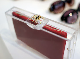
How special are these Charlotte Olympia pouches below?

Love these interchangeable patterned pouches within a lucite pouch! You can see your pretty bag but you cannot touch it! There are several colored pouches to choose from; for example, a leaf, an ecru striped or a leopard print. All these so perfectly give you options to pair with any ensemble. To top it all off, the spider and pineapple clasp are to die for! These special clasps magnetically fasten.
TRANSPARENCY IN ARCHITECTURE:
Diller and Scofidio are one of my favorite architects of this time. They are provocative designers who celebrate the potential of architecture by exploring how technology informs and affects our lives.
Their visual and performing arts Moscone Convention Center in San Francisco introduces voyeuristic distance as a design motif. A large video screen with fixed video cameras pointing towards the building and away, travels along the surface of the exterior facade. It broadcasts live and pre-recorded video imagery of fictional office building occupants on the screen as it moves. Your really not sure if you are being watched or are you watching people inside the building. Is it fictional or real? Are you observing or are you being observed? Would love to visit and experience it myself!
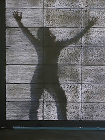
In 2001, a Hungarian architect named Aron Losonczi invented a light transmitting concrete. Yes, I said a concrete block that you can see thru!! Future homes can have foundations built above ground with the ability to transmit light into your basement. Brilliant! It is manufactured by a Hungarian company named LiTracon where optical glass fibers are blended within concrete. The fibers become a component of the concrete since they act like small pieces of aggregate. These blocks are suitable for floors, pavements and load bearing walls. Learn more. See images below:
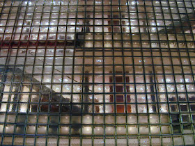
Lightness, transparency and brightness describes architect Renzo Piano's Maison Hermes building in Ginza, the shopping district in Tokyo. See image below:
The building's facade is entirely made out of an innovative fabricated glass block. Renzo Paino collaborated with Seves glassbock company to create a building that replicates a Japenese lantern. In the daytime the translucent facade gives a hint of what is beyond, but blurred by the thickness of the glass block. At night the entire building is glowing from within.
At eye level, the glass block facade is punctuated with clear glass block which displays Hermes products beyond.
What makes this glass block unique are the painted metallic edges of the block. This innovative detail accentuates the luminous reflection of the Hermes building.
(images from Source)
TRANSPARENCY IN INTERIOR DESIGN:
The Elizabeth Arden’s Office space in Stamford, Connecticut by Highland Associates is brilliant. It successfully incorporates the essence of their brand thru an unique architectural element that inspires. It’s the acrylic curved feature wall that has 8,400 holes punched with makeup brushes. I love the texture it creates on one side while allowing light to transmit thru from space to space. Office workers can sit in the lounge area and observe thru the wall but also be observed. See images from Interior Design below:
 |
| (all images: photo credit: Photo by Eric Laignel, Interior Design) |
TRANSPARENCY IN DECOR:
Would you invite a friendly ghost in your home? Here are some beautiful examples of modern ghostly furniture:
I love how Artist John Houshmand aims to expose wood as it really is. The transparency of the glass reveals the beauty of wood and he celebrates salvaged hardwood's wormholes, cracks, splits, etc and calls attention to it in a functionally beautiful way. See image below:


No comments:
Post a Comment
Note: Only a member of this blog may post a comment.