Pages

Thursday, November 29, 2012

Mod Must Haves for lighting lovers


MOD MUST HAVES
stylish, modern, unique
for lighting lovers


At first I was drawn to the differential textures of rough against smooth...

Sapi Chandelier by Eva Menz Design  SOURCE


Then a closer look.....


Sapi Chandelier by Eva Menz Design  SOURCE


The chandelier by Eva menz design is composed 
of several hundred bone pendants. Wow, pretty 
amazing how the light bounces off each jagged edge!


Sapi Chandelier by Eva Menz Design  SOURCE


Eva Menz Design explores any material and specializes 
in sculptural pieces that are magical and spatial!

Sunday, November 25, 2012

Designer Spotlight Part 2: John Houshmand's retreat Villa Tierra Adento

Welcome to Part 2 of my interview with the talented artist and furniture designer, John Houshmand. In Part 1 of the interview, John described his imaginative furniture-making and process. To read all about it, click HERE.

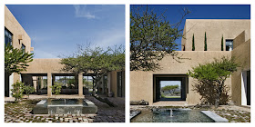
Below John Houshmand kindly takes us behind the design of his own retreat - Villa Tierra Adento in San Miguel de Allende, a hidden treasure with a thriving artist’s community, and a shoppers paradise for finding odd and interesting things. The villa’s elemental architecture is breathtaking...encompassing air, earth, fire, water, and metal,…its pure geometry is set perfectly and born from the desert’s landscape. Oh! the views, especially by the pool! The house is meant for tired city dwellers to escape. I wouldn't mind being a guest!


John Houshmand recounts his experiences designing his home. "Working with my friend and colleague David Howell on my house in San Miguel de Allende was perhaps the greatest yet the most fulfilling challenge. It involved shared egos, shared vision, four years, a huge project of 12,000 square feet of house, 8,000 square feet of patio, on almost 9 acres of land, with 360 degree views."


John adds,"We built in the local material and technology vernacular to a sensual minimalist design around a hacienda program, and got a result that is amazing. I wore every hat on that one, and it was in a foreign country. The result is a testimony to a truly challenging and special process."


Looking at the villa's courtyard pictures brought back wonderful memories of living in Barcelona, Spain and visiting Morocco. Life is enjoyed around the courtyard experience and I understand John's inspiration.  He specifies the architectural layout and design for the Villa: 

"The rooms are all arranged around a courtyard replete with lemon and orange trees and a tranquil fountain. The traditional dimensions (4 meter ceiling heights etc) are merged with the traditional building methods (boveda brick-domed ceilings, viga flat ceilings, terracotta tile, wood oven in kitchen, the pyramid-in-pool feature, the stone construction of the 'music room' and the 'gallery', and more. Even the color of the house was taken from the earthen color of the hill upon which it stands. But all these features were abstracted into pure forms, and the colonial details were left out totally... no wrought iron, no curved arches, all these were ignored in favor of a powerful and elegant simplicity."

The interior spaces are as special as the exterior. I really love the beautiful architectural and furnishing features such as the grandeur of each space; the large spans of glass allowing the outside views in; the movement and texture of the brick boveda ceilings; the sunny and warm red-orange-yellow accent colors and John's own animate furniture pieces. Inspiring!


Take the journey inside with John.... "The interior design was accomplished as a collaboration with architect David Howell and his wife interior designer Steffani Aarons. The architecture was to be a canvas upon which to paint the art, furniture, and collected items that honor the Mexican hand and heart (Mexico has the largest number of artisans in the world), as well as the work of friends and my furniture design. Pieces were gathered from the roadside antiques stores, San Miguel’s shops and artists, and more. All upholstery, curtains, and fabrics were done from local shops...."


Thank you again John for the eloquent interview! 

I really love your retreat and how you and architect David Howell integrated 
local artisans and materials into the architectural design. Beautiful!

To connect with John Houshmand, 
you can link to his WEBSITE, BLOGFACEBOOK, and TWITTER.


Friday, November 23, 2012

Designer Spotlight Part 1: John Houshmand's reclaimed furniture design


John Houshmand 
Shazam Glass Low table with Spalted Maple Microslab #0187.1

John Houshmand is an innovative designer and furniture-maker who designs unparalleled sculptural furniture composed of reclaimed wood, glass and steel. He is dedicated to the eternity of trees and celebrates nature by integrating all its knots, cracks and wormholes from Black walnut and elm trees. Every one-of-a-kind piece emphasizes trees' beauty and infuses nature into interiors. A John Houshmand piece is a statement to any space. He has a New York City showroom but all the magic happens on his 900 acre farm in Upstate New York. His philosophy is simple, “We allow trees to do the talking. We simply listen.”

Read on to learn more about John’s stunning work. He has given Mod Design Guru an exciting, witty and thoughtful interview, so detailed that I decided to break it up in two parts. One of my favorite interviews thus far! Below he takes us behind his designs and gives his thoughts on sustainability for his furniture-making process. Part two of the interview will showcase the architectural features of his Mexico retreat, Tierra Adentro. Its amazing!


Interview with John Houshmand - Part 1:


Can you describe the magic in your designs that marry rustic and modern and defy gravity?

Oddly enough my greatest inspirations are musicians and composers. I play spontaneously composed and arranged music, and it is in that world that I get the greatest hand-to-god connection, and I look for that vibrational resonance in my 3-D creativity as well as. So the music of Keith Jarrett and Pat Metheny, Coltrane, Brad Mehldau, and others at that level are my constant companions. If I can use that standard as a way into the making of a static (or not so static) object, then I might get more fairy dust onto a piece than if I approached this as a design effort. 


Shazam Glass Low table with Black Walnut Microslab #0187


Black Walnut Dining Table with thick Acrylic legs#0023.3


Black Walnut Dining Table with thick Acrylic legs#0023.3


Black Walnut Desk with Acrylic legs #0184


Take us behind the design of your Tattooed Acrylic and Wood table. What was the inception of the idea? 

The tattooed designs started with a collaboration with Rockwell Group for a hotel in Asia. The call out was for literally "tattooed" wood, and everybody thought laser etching was the way. But the tests created a black micro-groove in the wood. When they asked us to go to beige and flush, we shifted to mechanical etching and a proprietary colored fill. Worked great! Then we said let's do it on 2" thick acrylic. Looked seriously amazing! And the clincher was when we said, "Let's go back to the laser, and groove it 1/2" deep, then fill with black, and get "curtains" into the matrix of the acrylic."
 Viewed on-axis you see the graphic. Viewed off-axis you see this wonderful inner world inside the acrylic slab with curtains of  black resin. We are going to try it with different colors and get the "aurora" table...


Tattooed Custom Etched Graphics


Solid Oak Outdoor table Dining Table  with 
Tattooed Custom Etched Graphics #0240


Tattooed Custom Etched Graphics


Solid Teak Outdoor table Dining Table  with
Tattooed Custom Etched Graphics #0241


Tattooed Custom Etched Graphics


With the shift in open plan living, will we see more designs like the console with ebonized and gray wash on Black Walnut?

So many of our pieces are really sculptural and as such are meant to be viewed in the round. We have designs on the books that reinvent different pieces, and the use-ability of these pieces. Often, access from both sides or all round is a new approach but one that gives new use as well as great visuals. Also we have envisioned hospitality uses, such as hotel suites where armoires are not against walls, mini-bars are corner mounted into tonsu-like units, and such. Let's get multi-dimensional here... It brings new uses, new interactions, and great design opportunities.


Console Cabinet with Ebonized doors and 
Gray wash and Black Walnut doors #0087.9


(all images courtesy of John Houshmand)


How did sustainability become a priority in your furniture making process?

I’ve gone the full circle from unhappy urban consumer to bored large-scale functionally monastic designer, manufacturer, and farm owner. Our culture is really quite ill when you turn the TV on, visit the mall, and spelunk the minds of many western semi-individuals. And the design world as a safe haven from that is a misnomer, as we are all still feverishly trying to make more stuff. Stuff is business, and business is profit margins. Can we have a rich life with fewer things that really mean a lot to us? What are the RELATIONSHIPS by which we acquire the stuff of our lives? It is really simple from a certain perspective: know the true necessity behind what you gather around you in your life. If we all owned HALF of what we owned, and made it last twice as long (our work will last hundreds of years at least), there you have an elegant calculus. Add to that the basic tenets of sustainability (proper materials, minimal radius, reusable/cyclable, low energy consumption, etc) for as many things as you can, and it is a start. Forget most hype, nonsense marketing, and green-washing. Almost nothing is very green: car, toaster oven, production foodstuffs, plastic anything, electronics, you name it. We are fooling ourselves. I am not advocating being a luddite, but let’s get real and stop the bullshit. At least ACCEPT that this is true, and maybe the mere consciousness of that alone will put a good worm in the brain, and little by little we will find ourselves wanting less, valuing the stuff of life, and getting an intuitive sense of how to make this world right. Good relationships, good food, good music, travel, study and love for the entire time you are on this planet, and an insistence to make this place better when leaving than when you came, that is sustainability. I have often wondered why millennia (yes millennia!) of human lives are spent in some deluded religious obsession with heaven or hell in the afterlife when it is about now and here. This is heaven or hell, depending on what you and I do. Start now. 


To connect with John Houshmand, 
you can link to his WEBSITE, BLOGFACEBOOK, and TWITTER.


Stunning work! 
Thank you John for an amazing interview! 

Part 2 of the interview of your gorgeous Mexican retreat 
Tierra Adentro to be posted on Sunday!!


Tuesday, November 20, 2012

Mod Doggie Diggs

MOD MUST HAVES
stylish, modern, unique
for the dog lover


What appeals to your modern standards must appeal to your doggie too! Every dog should have a special place to call home in your home. Check out these really cool doggie digs:


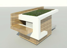
The reclaimed wood Dog RE-treat is designed by Alejandro Pijuan, designer with LA architectural firm Johnson Fain.  His Siberian Husky inspired him to design and build what a dog wants and needs for shelter. The house will ultimately be auctioned off with proceeds benefiting a husky rescue group called Alley’s Rescued Angels. I really love his use of materials and its slatted horizontal reclaimed walls. Your pup would love to bask in the sun on its grassy rooftop too.


Dog RE-treat (Source)


Your pup will feel invited to every party nuzzling inside this cozy and mod BowHaus sanctuary by DenHaus. Made out of powder coated steel, it doubles as an end table with its sleek curve and peekaboo starburst cutouts.  Looks easy to clean too. 


BowHaus (Source)


Playful and artful futon suede beds called Mod block by Crypton Home are perfect to pamper your pooch! Its Crypton super fabric is stain, moisture and odor resistant. Love  its colorful block prints, environmentally friendly too!


Mod Block Bed (Source)


Monday, November 19, 2012

Top 100 Interior Design Blog competition on Modenus


The Top 100 Interior Design Blog competition is running on MODENUS and Mod Design Guru was nominated! The list is extensive with 188 blogs right now. 

“Thumbs Up” for Mod Design Guru would be much appreciated! Click HERE to vote.

Voting closes on Friday, November 30th at 5 p.m. NY time. 

To Vote:

1. Login to (1) type of social media:  Facebook, Twitter, Linked in or google +
2. Click on MODENUS page HERE
3. Look for Mod Design Guru and Click 'Thumbs up' next to # of votes
4. Select the Social media you logged into and then the box should fizzle out.
5. Click on thumbs up again to cast vote


MONDO THANKS!!

Saturday, November 17, 2012

Nate Berkus Home Collection for Target


MOD MUST HAVES
stylish, modern, unique
for the travel inspired


I came across Nate Berkus's new bedding and bath line for Target. His collection was based off of pieces that he has bought for himself over the last 20 years of traveling.  I really loved the color palette, and play on texture and pattern. You can really mix and assemble all the different geometric patterns very easily.  

I snapped some closeup shots - here are some of my faves:


Napal Cevron


Rectangle Basket


Villa Bath Collection


Foil print decorative pillow


Snakeskin decorative pillow


Woven Twill decorative pillow


Scattered Stud decorative pillow


Monterrey decorative pillow


Ikat Link Bath Towel


Nepal Chevron

Thursday, November 15, 2012

Design your dream dining room with Layla Grayce


I feel honored to have won the Layla Grayce/Olioboard- Design your Dream Living room contest judged by Jonathan Adler. Here was my winning board as part of this awesome series called "Express Your Style":


I was excited about this series so I entered the final Layla Grayce- Design your Dream Dining room judged by top designer Tobi Fairley. She has a fresh and colorful signature style and yesterday she mentioned my winning board on her blog. Read the article here.

Below is my dining room entry called Grotto. The foliage is from my yard. This tree is magnificent in the fall and creates such an intimate space under its branches. I thought it would be a perfect setting to dine with friends. If you would like to vote for my board, click here. Thank you!!


Layla Grayce- Design your Dream Dining room contest entry

Saturday, November 10, 2012

Designer Expedition: Junior League of Boston Show House 2012


The Potter Estate, Newton MA

The Junior League of Boston hosted its 35th Show House at the Potter Estate, an impressive historic Victorian estate,now administrative offices for the Jackson-Walnut Park Schools. The Junior League worked with 35 designers to transform the Potter Estate into an incredible landscape of creativity, amazing materials and design. Each designer did their magic and brought the house into the 21st century. 


From left to right


Four of us from NYC (Jennifer,Lynn, Sarah and myself)  traveled to Newton to see the Show- House and support our friends that participated in this event. - Laurie, Elizabeth, Kristen and Mally. We called ourselves the #designer caravan!

It was a wonderful experience walking through the house. Here are some of my faves:


Inner Sanctum: 
solace and earthy...


Designer Laurie Gorelick designed a restorative space for the lady of the house to seek refuge from her daily stresses. The bronze palate and natural elements informs its user to refresh the mind, body and soul. I  felt very relaxed in her space and was ready to have a drink,  write in my journal and curl up to take a nap on that comfy chaise.


A Young Woman's Bedroom: 
playful and cheerful...

Designer Mally Skok created a youthful space where she mixed and matched her own vibrant fabric lines. She plays with colorful and geometric patterns on the walls, floors and upholstered furniture which juxtaposes so well with some of the fun and quirky details in the room. Love the beaded mirror!


Inspiring Bathring retreat: 
dramatic and lush....

Designer Ana Donohue surprises us with this lush bathroom. Your eye is drawn to the many layers of pattern ,color and material. I really liked the moodiness of this space.


The Green Room: 
tranquil and harmonious....
Designer Elizabeth Bendedict created a special spot off the kitchen for the woman of the house to decompress. It is a calming palatte of apple green, aqua and lilac with a mix of organic elements. Would have loved to sip a bit of tea there!


Master Bedroom: 
worldly treasures....

Designer Kristen Rivoli created a Master Bedroom for a well-traveled couple. Details and collectibles from their honeymoon in Morocco and their year living in Paris shaped the room into a romantic haven. Ooh la la, you feel transported!


La Sala da Bagno (The Bathing Room): 
sexy and dreamy....

Designer Stephanie Rossi designed a playful and theatrical space filled with erotic photography, over-scaled lighting, intimate seating and surreal elements like butterflies and cocoons. She celebrates the users ability to feel confident, sexy, luxurious all in a private world. To shower here would be an experience!


From left to right

I had a wonderful day with my designer buddies discussing design, food and exploration!

Can't wait for our next venture!!

xoxo

~M