Pages

Tuesday, January 28, 2014

Geologic Trends in Home Design 2014

Ever take long walks and really look at how weather affects nature? The passage of time takes its toll on trees, rocks and the earth and its those worn edges and surfaces that are the most interesting to me.....especially  when rocks reveal their crystalline layers. Its wonderful when you can bring nature inside your home...a fresh cut of flowers, a shell collection or even a beautiful rock that you found on a walk one day.  I have noticed that today's designers are now integrating geologic inspired designs into home interiors. 

 
Balanchine collection 

The Agate for example  is a beautiful stone and has become a hot trend. I have recently seen it used in lighting, stone surfaces and wall murals. The agate structure is composed of a banded nodule that is filled with a translucent, multicolored chalcedony. The parallel bands are so intense in color that the agate is like jewelry for the home.... Lusive Decor showed off the Balanchine collection at BDNY.  Its multiple geometric brass chains suspend different unique agate structures ultimately creating a curtain wall of color and pattern.... Its affect is quite distinctive and beautifully ornamental.


Concetto CaesarStone 8531 Blue Agate via

Caesar Stone makes an extraordinary stone surface collection called Concetto that blends art, nature's hues and design and technology. Its beautiful surface is hand-made from semi-precious stones.....oh my!...an ultra luxury stone surface. Its a wow stone! The colors are so intense that it would definitely be a conversation piece in your home.


The wall mural company Pixers brings blank walls to life. Their murals are vivid, environmentally friendly and customizable.  I love the deep blue colors in the Blue Agate mural above...it draws you into its crystallized surfaces and would make an uh-mazing backdrop.


Chalice


Volcanic Tube Vases

Ceramicist Josh Herman develops sculptural forms that come alive with his applied volcanic glaze. The innovative surface looks geologic, perhaps meteroic...pocketed with craters. His tubular forms are organic and dynamic.... wouldn't you want one of these distinctive sculptures in your home? Love it! Check out his Volcanic Tube vases on Design Within Reach.


The contemporary Summit Collection (on right) by Surya creates a geologic inspired wool rug surface using a hand -knotting technique. Its felted wool looks so comfy cosy for your toesies! How about the Surya Pouf-14 (on left) using the same means of construction....I love its pebbled inspired look....adorable!


photo credit: HG Esch and Joachim Grothus

Seating stones designed by UN Studio for Walter Knoll was inspired by the rhythmic smoothness of geological formations. The sculptural Seating Stones exhibit a playful take on spatial awareness and versatility. The design presents a myriad of possibilities for placement, color, texture, arrangement and communication. Love it!


To get a daily dose of design, 'LIKE' MoD Design Guru FACEBOOK page.

Monday, January 20, 2014

All A-Buzz: Hexagons in Home Design


I was a math major in my college days ( I know...big snore) but I had the opportunity to study pattern which was very interesting. The hexagon was one of my faves.... It is a graphic and powerful shape and has been popping up a lot in home design lately. A popular trend one would say...


J'adore the new Modern Vintage collection of upholstery textiles from Carnegie Fabrics. Carnegie nods to traditional tapestry detailing by hiding the warp thread. This technique allows the cluster of hexagons to look crisp and modern. 
I also love love love the handbag, I want one!


Note Design Studio dreamed up the POV candleholders. Simplistic lines that create a three-dimensional hexagon. Very distinct.


POV candleholders (terracotta on the left and petroleum on the right)
Try a hexagon pocket to store your favorite things. Ampersand has created Wallpockets, inspired by clusters of barnacles, that utilizes space in an unique way. I like how the wall becomes dimensional and textural!


To get a daily dose of design, 'LIKE' MoD Design Guru FACEBOOK page.

Thursday, January 16, 2014

Thanks to MOMA: Say BYE BYE to the American Folk Art Musuem


It’s a SAD day. It has been announced that MOMA has finalized its decision to move forward with the demolition of the American Folk Art museum, the building's metal façade is a celebration of materials, a tactile and significant architecture... Dear MOMA, STOP. THE.INSANITY! An influential museum as yourself is destroying a building that IS art? I know that tons of designers, architects and critics have tried to convince you otherwise to integrate this folded modern façade into MOMA’s existing building fabric. I’m puzzled that condemnation is your answer? Unfortunately, this is an indelible mistake that will not be forgotten.....MOMA will not only change its look by the new expansion but also its compass in the architectural and art world...

To get a daily dose of design, 'LIKE' MoD Design Guru FACEBOOK page. 

Monday, January 13, 2014

Watercolor Trends in home design

Black Crow- Angelino

Reminiscent of the works of watercolor impressionists, designers today are taking a more free-spirited approach with fluid layers of color. When I think of watercolor, I think of a watery, subdued and calming feel. But lately, I have noticed a more vibrant, painterly design experimented across  home design.... 


I ADORE Tracy Hiner's Black Crow Studios watercolor collection that showcases large scale murals with a watery effect. They are wonderfully modern and beautiful...absolutely gorgeous blending of colors! Tracy sent me some of her latest works...


(images via Blackcrow studios)


Designer Aino-Maija Metsola of Marimekko created a bold collection of fabrics, home textiles and tableware entitled Sääpäiväkirja meaning Weather journal- where  she drew  inspiration from the Nordic weather such as rain, fog, light and wind. Rain showers and crisp cool days are common days in the Nordic. I'm loving the many layers of splotchy watercolor dispersed between scratchy pen lines. Surya manufacturer of area rugs and home accessories are making some beautiful pillows and rugs with a watercolor effect.


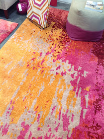
Surya manufacturer of area rugs and home accessories are making some beautiful and fresh designs too with a painterly effect....At BDNY, I met Satya Tiwari, the son of Surya Tiwari and president of Surya's U.S. division. He was great...friendly, down to earth and excited about their new colorful collection that merges fluid layers of pinks, fuschia and orange...


Satya Tiwari


Loving the artistry in the pillow collection showcasing flowing brushstrokes.

 (HH-016)


Banshee (BAN-3347) has stunning colors of fushia, plum and magenta


To get a daily dose of design, 'LIKE' MoD Design Guru FACEBOOK page. 

Friday, January 10, 2014

3D Printed Fashion, Architecture and Media: threeASFOUR MER KA BA

I was fascinated by the threeASFOUR MER KA BA exhibit at the Jewish Museum...it is creative, unique and moving!! Inspired by the symbolism of geometry and the tile formations found in mosques, synagogues and churches, it is a contemporary mixed media installation using 3d printed fashion, architecture and video. The avant garde design team threeASFOUR collaborated with architect  Bradley RothenbergStudio Christian Wassmann, and 3-D animation designer Alex Czetwertynski bringing together ancient symbols with cutting edge-technology. Get mystified and catch the exhibit still running until Feb 2nd. When you walk into the space you will be taken aback by a featured pyramidal structure with projections of light and printed fashion suspended above you....


I learned that "MER KA BA the phrase has roots from ancient Eqypt. Mer (rotating light), ka (spirit) and ba (body). Placed together the merkaba is described as an energy field through which which the soul enters the body and ascends to higher planes."


Walking thru the exhibit you feel an energy.... like the merkaba is everywhere from the synthetic fabrics to the lighting to the animations to the pyramid.... The patterns and prints are architectural and loaded with geometrical  intricacies....


I was fortunate to meet architect Bradley Rothenberg, responsible for the 3D printed MER KA BA prints, at a lecture last year about 3d printing and fashion. I was extremely fascinated by the fractal nature of these MER Ka BA designs and was able to ask Bradley Rothenberg to DEFINE WHAT A FRACTAL IS....

He adds, I think Mandelbrot is the best to reference when describing what a fractal is -- he coined the term from the latin adjective fractus, the corresponding latin verb frangere means "to break."  To create irregular fragments.  He came up with this term to classify a new set of 20th century geometry that could better describe nature than the classical mathematicians of the 19th c. For me, a fractal is a mathematical system that involves the same structure on multiple scales to create the complexity that we usually see in nature.


DESCRIBE HOW FRACTALS HAVE INSPIRED THE SYMBOLIC LATTICE WORK

We started using fractals because we wanted to create a new way of making interlocking textiles.  Fractal's seemed to have a lot of potential because the same geometry could repeat & interlock with itself, while changing scale creating a textile that could have different performance characteristics throughout.


HOW COMPLEX DOES A FRACTAL PATTERN HAVE TO GET IN ORDER TO PERFORM AS A FABRIC?

You don't have to use a fractal to make something textile-like -- think chain-mail -- however, the complexity of the fractal allowed us to make a textile that had different textile characteristics throughout the textile, something that transitioned from being a very flexible & fine fabric, to thicker more sculptural areas.  Had we been able to print at a higher resolution than the printers can currently print at, however, we could have had something even more closer to a fine textile lace or silk.  In the project we were able to run the fractal through at least 5 generations -- Because a fractals complexity increases exponentially, if we could have run the fractal 100 generations we would really be able to recreate a number of properties one usually only see's in nature -- think the way skin wrinkles around certain joints, or the level of detail within the branches of a snowflake...


Winding at the end of the exhibition is the wow moment...inside the pyramidal structure are mirrored walls shaped like a six-pint star by architect Christian Wassman. The reflections are perspectival in an artful and soulful way...  


To get a daily dose of design, 'LIKE' MoD Design Guru FACEBOOK page.

Tuesday, January 7, 2014

CONVERSATION pieces for your home

Back in 1913, artist extraordinaire Marcel Duchamp, (one of my fave artists)... invented readymades, objects that challenged assumptions about what constitutes a work of art. In Duchamp's Bicycle wheel, some may only see a bicycle, but to Duchamp it was taking something that was already prefabricated and turning into sculpture.  

Bicycle Wheel, Marcel Duchamp, 1913 via 

Today's modern equivalent of turning something typical like a bicycle wheel into functional art goes to Phillips collection  - with their recycled bicycle screen...love it!  I thought it was a great conversation piece when I saw it at BDNY. They took the ordinary and yielded the unexpected. Its somethin' to talk about...


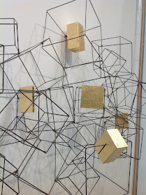
I think its very important for spaces to have pieces that are bold, unique, and memorable....... Take Gold Leaf Design Group's dimensional wall sculpture of metal and gold leaf for example. Its exciting to look at... 


With an environmental focus, Gold Leaf Design Group takes natural resources and introduces gold leafing and cladding onto handcrafted wares. The recycled wood sculpture below is cladded in brass and copper...


Your light fixtures can also demand attention. Bistro by Troy lighting assembled forks, spoons and some sparkle... Great piece for the home owner who wants something new and interesting over their dining room table.


To get a daily dose of design, 'LIKE' MoD Design Guru FACEBOOK page.

Friday, January 3, 2014

SENTIENT: fur for your home


SENTIENT Caribou Lounge

A year ago, I was walking the streets of Cologne, Germany with excitement as one of thirteen designers on BlogTour Cologne. With new friends we studied the Bauhaus architectural landscape as we anticipated our first meal...aaah the Vienna schnitzel..  I remember my stomach growling but all the newness in a new city satiated my hunger. Upon our first stop was the cutest little restaurant with seats covered in fur. I loved the thought of curling up into one of those furry chairs but unfortunately the restaurant was closing up for the night. I snapped a quick pic in hopes of finding something comparable in the States some day. (see below)


Over the year, I've seen some great fur on the runways.... but not at any of the design tradeshows...boo...until...  BDNY where I found SENTIENT, design furniture handcrafted in their Brooklyn studio. Love it! 


Fur set within reclaimed oak is pure old world luxury. A nice hard edge to its contrasting softer depths. I also love how the Antique oak showcases its knots, holes, and cracks. See some of their other delish designs..

The Long wool Sofa has crazy wild long hair Icelandic sheepskin wool with gorgeous array of warm beige, brown and golden colors. Designed by Chief design officer Nersi Nasseri.


The Carabou lounge combines luxurious soft Coyote fur with American Walnut.  To Die for..I'm SMITTEN!


To get a daily dose of design, 'LIKE' MoD Design Guru FACEBOOK page.